The sharp, hard, enclosing lines of Modernism; a reflection of metaphysics founded on distinction, stability, repeatability.
Bibliographic and digital textuality are both laid out according to grids. Everything has its own apportioned space.
 |
| page layout |
 |
| the digital page |
 |
| page folds |
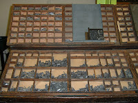 |
| type fount |
 |
| radiant medium |
Visual and material expression doesn’t fit into nicely delineated units. Marinetti’s At Night, In Her Bed breaks free from the normalized typographical matrix, embodying tumultuous affect:
The poetic experimentation of Marinetti, Tzara, and others laid the path for typographical manipulation. The Helvetica font is a movement in a more rational direction; it is a face for the form; Helvetica and its derivatives (like Arial) are uniform, clean-line typefaces intended for all uses and purposes (evidenced by its predominance in contemporary culture). The drive to create an organic typeface backfires into infinite repeatability, the same flaw of Pruitt-Igoe.
 |
| Helvetica, est. 1957 |
 |
| Pruitt-Igoe, est. 1954 |
We can put pi into a clean, neat shape, but that doesn’t make it any less irrational; you can’t quantify the unbound; a squared circle isn’t a circle anymore. “On the grid, there is no room to grow.” Grid as anti-rhizome?


I love it, man. Your blog's ownin ownin'
ReplyDelete